Brand Identity for Iceland’s Space Department
Space Iceland links stakeholders together to foster the creation of a National Space Plan. They map Iceland’s activities, potentials & attempting to build a grassroot of enthusiasts, industry, science, and policymakers.
The concept behind the Brand
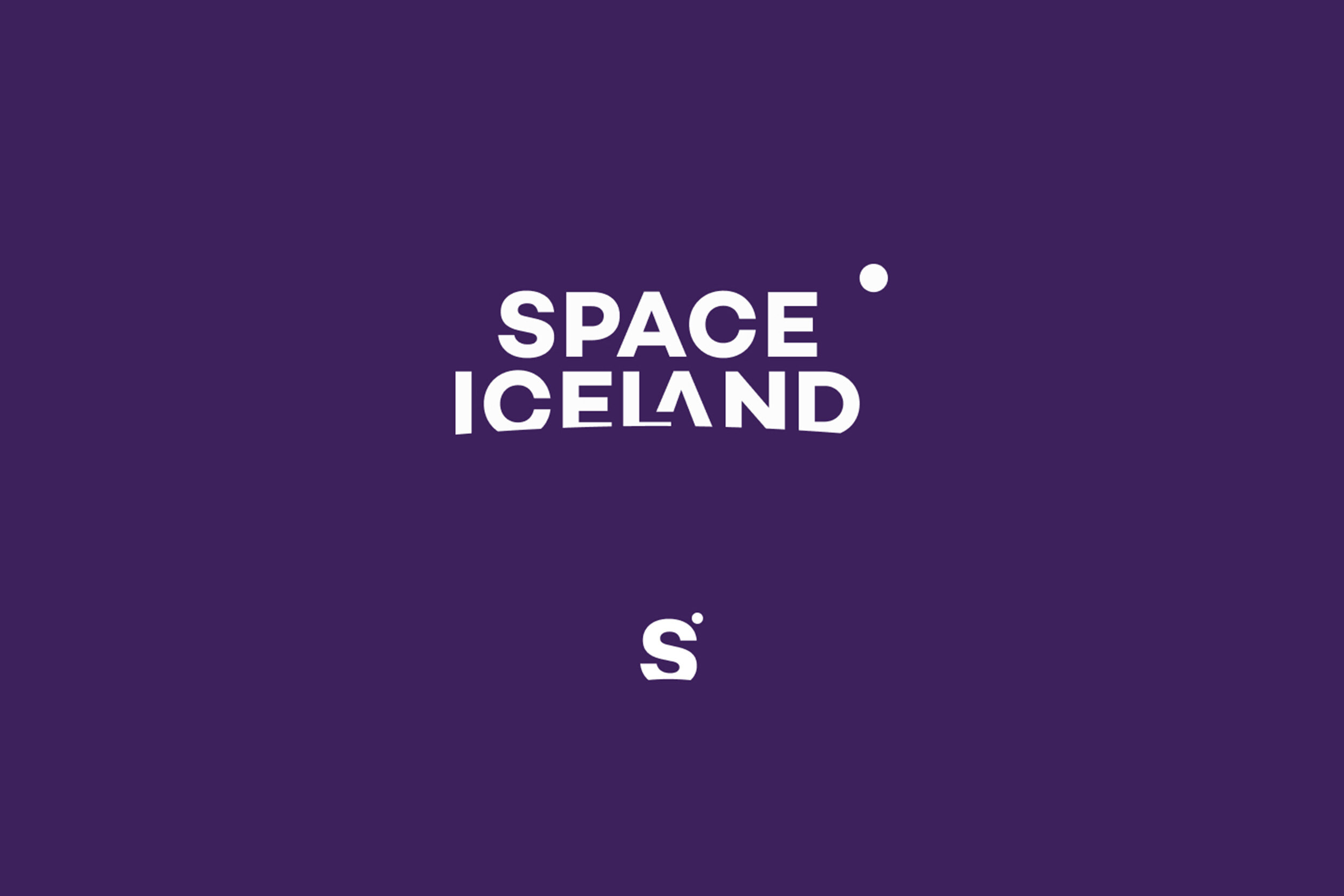
The concept behind the brand was to illustrate how Space Iceland connects different parties, big and small, to enhance collaboration and increase opportunities in the space sector for different Icelandic industries. The meaning behind the logo is how Space Iceland is the bridge between different parties as well as illustrating distance between objects both big and small.

The typefaces
Campton is geometric Sans Serif typeface in four weights that illustrate the geometric forms of the space and the moons, planets, solar systems etc. Campton was designed of the German type designer Rene Bieder.

The Colour Codes
The concept behind Space Iceland colour palette is it illustrate the Icelandic nature. The northern lights, the midnight sun, the black beaches and harsh winters. Together the colour palette creates a harmony that stands out and at the same time being true to its nature.

The Pattern
Space Iceland’s pattern is used as an add-on to the visual parts of the brand to give it more mystery and to illustrate how we map the unknown ares of the universe.

Images
The concept behind all images for Space Iceland are on one hand from a persons viewpoint standing on earth looking up in the space wondering what might be ot there and on the other hand a top view look down on the Icelandic nature with the eyes of a distant guest.


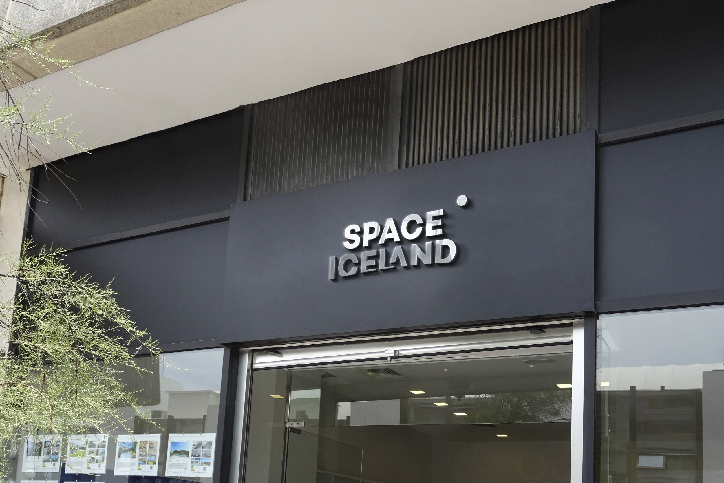
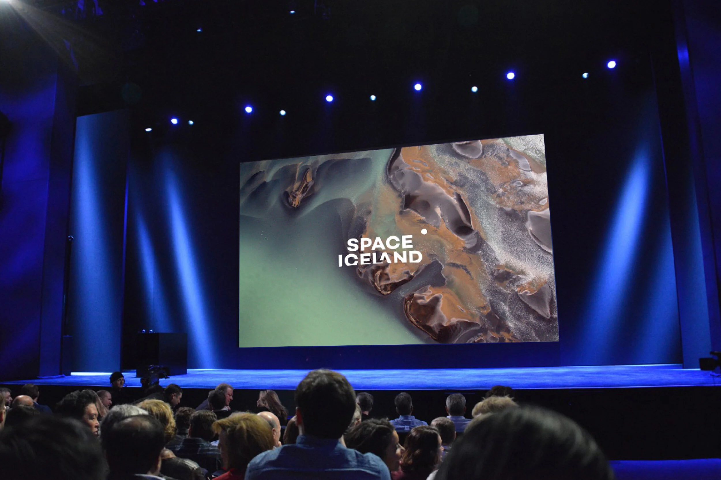
In the wild